Thursday, March 31, 2011

Pre-Prehistoric


REH

Coming from Oop, it's one prehistoric brute to another. This brute, Conan, has another big screen adaptation coming out and Jason Mamoa looks pretty great as the big guy. Hmm, I wonder who would be great to star as Alley Oop in a movie adaptation?

It looks like the Conan film might be pretty supernatural, just as I remember the REH books to be when I read them as a teen. Of course Frazetta's covers set the tone unlike any other artist. But the comics versions had some good moments too, from a variety of artists.

Monday, March 28, 2011

Let Nature Take Its Course

Not only am I swamped with deadlines, but I'm in process of moving home and studio. Major move. I'm without internet during the switchover, so I'll be back when I can.

Until then, bonsoir mes amis.


Sunday, March 27, 2011

Mebbe You Think It's Funny

Unavoidably skipping 2 weeks from last time, I'd say we can pretty much tell that Ooola has met Ceele.


Friday, March 25, 2011

Footprints in Your Whiskers

Good golly, I thought I was busy before! I've had brand new deadlines sneak in on top of old deadlines, and they're all deadlining together. I have a choice to either go on hiatus for a couple of weeks, or keep posting an Alley Oop every once in a while, since I have those lined up. Sorry to say, there's just no time for any other choice.

I've got some wonderful stuff down the road, but I gotta make a living!


Thursday, March 24, 2011

BONGGggg

I can't stop myself from posting these Alley Oops! They're like candy, all colorful and chewy. Can ya put up with a few more of these before I change the subject?

Still dedicated to charlie, our favorite nonagenarian, who can't get enough Oop!

The nice thing about Alley Oop strips is that you don't need to see every strip in a sequence for it to make sense and be fun. Like here, we've skipped over one that's missing. Oh well.

Tuesday, March 22, 2011

Kidnaping On Your Mind

Let's keep looking at a few of these Alley Oops and then we'll intersperse them with other stuff. These are so nice and colorful.


Monday, March 21, 2011

Princess of Gonwanda Land

Alley Oop has kind of a cult following, with people who are forever seeking a strip here and a strip there to collect. I wish I had more, but at least I do have a few to share. This post starts a partial sequence of 18 strips, starting in the middle of a storyline, missing some here and there, and stopping abruptly. But that doesn't matter to cult followers, and hopefully not to the rest of you either.

I only have time to scan, clean up and post one strip every few days, but maybe that will keep some of you coming back again. And the rest of you . . . well, try to enjoy them anyway.

These strips are dedicated to our friend charlie, who is krazy about komic strips!

I'm calling this arc Princess of Gonwanda Land.

Duo of Dulacs

A duo of Dulacs, floating loose in the image morgue:

Edmund Dulac — Masqueraders

Edmund Dulac — Madame s'est piqué le doigt.

Sunday, March 20, 2011

Cowgirl

This is a print I bought long ago in my Chicago days. I love cowgirls!

Cowgirl — circa 1930, according to a note on the back

Saturday, March 19, 2011

Princess of China

Georges Barbier — Turandot-Princess of China — 1922

Friday, March 18, 2011

Persephone

Thomas Hart Benton — Persephone — 1939

Thomas Hart Benton is a grand old fixture of the history of 20th century art. Yet Robert Hughes, venerable art critic for Time magazine, cited Benton as "a dreadful artist most of the time . . . flat-out, lapel-grabbing vulgar, incapable of touching a pictorial sensation without pumping and tarting it up to the point where the eye wants to cry uncle." Don't hold back Mr. Hughes. Benton was painting 'fine art' for museums, not 'cover art' for pulps.

One of Benton's more controversial paintings was that of Persephone, a modern allegory of Pluto, in the guise of a Missouri farmer, gazing at the sleeping goddess.

Benton's painting process was not simple, but fell into line with the practice of many painters, making thorough use of preliminary procedures:

Above, before painting, Benton produced many graphite sketches of every element that he envisioned in the image.

Above, he took various sketches and combined them into numerous compositional studies, gridding them for transfer to painting surfaces.

During the whole process, (above and below) inspired by the practice of Tintoretto, the 16th century painter, Benton worked out the spatial relationships of the figures and light and shadow by creating clay-sculpture models, that he used for further preliminary studies and the final painting.


Above, he also created black and white oil sketches to work out the rendering of tonal values.

And, above, a detail of a master drawing that he gridded for transfer to a linen canvas adhered to a panel, a whopping size of 4.5 X 6 feet, combining egg tempera and oil for the final painting, shown at the top of this post.

Epic

Speaking of Howard Pyle's epic representations, isn't it amazing how an epic painting, below, begins with a rough pencil sketch, further below—typical of the way he determined definite compositions.
Howard Pyle — The Coming of Lancaster
Illustration for Harper's Monthly — May 1908

Howard Pyle — rough sketch for The Coming of Lancaster

Thursday, March 17, 2011

Anthropomorphism

When you think of Howard Pyle's illustrations, you probably tend to think of King Arthur's knights, Robin Hood, pirates and other epic representations. But his early Wonder Clock tales slipped into some different kind of shoes — anthropomorphic characterizations, very nicely done.

Howard Pyle — from The Wonder Clock — 1888

In his distinctive way, this is what Wallace Tripp had to say about the subject, some 90 years later:

Wallace Tripp

Faerie Gliders

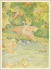
This is a sweet scene of faeries, here reprinted in a book, originally from a vintage Ladies Home Journal.

Oliver Herford —Faerie Gliders — November 1927

Wednesday, March 16, 2011

The Blue Bird

Here is a lovely study of birds for a playbill design at the Haymarket Theatre in London. At a time it would have been hard to find good photographic reference, these were probably drawn from observation and the imagination.

Frederick Cayley Robinson — The Blue Bird — 1909
Watercolor - pen and ink - pencil

Tuesday, March 15, 2011

What If?

I couldn't help myself. I used my break-time to envision a what-if. What if magazines of the early 20th century used the sensibilities of the early 21st century (assuming that we still get to use the cool art of the period)?

Class, look at previous post—compare and contrast.

Buchanan — mock-up

I probably would clip and save the cover, for the art, but maybe not.

Apologies to Vanity Fair, current management. I'm not picking on you, per se. Don't sue me. You're a big enough entity that I'm beneath your notice. These are not the droids you're looking for . . .

Character and Voice

Still, all in all, I think illustrative graphics give character and voice to a magazine, and I'm just surprised that some magazine editors wouldn't want to give it a shot again. The New Yorker certainly benefits from quality artistic covers. When are we going to see more periodicals go for the gold?

In the meantime, let's look backward again to the World War I era. Doesn't this cover have a similar mystique to some of Moebius' work?

Vanity Fair — November 1917

Monday, March 14, 2011

La plus belle femme du monde

There are times, I must admit, that a photo
is most appropriate for a magazine cover.

Photo (French edition) — December, 1998
(The Most Beautiful Woman in the World)

Sunday, March 13, 2011

Those Eyes!

Reese Witherspoon — 1998 — sorry, I don't have record of photographer

Always an Adventure

I love photographs that show the old days and the old ways. Travel is always an adventure, but it seemed more exotic in the pre-1960s.


Saturday, March 12, 2011

Moonlight Mermaids

Gertrude Alice Kay — Moonlight Mermaids — 1916

Friday, March 11, 2011

Reindeer People

© Susan Seddon Boulet — Reindeer People

Woodland Faerie

M. T. Ross — Woodland Faerie — 1914

Thursday, March 10, 2011

Dancer Study

I used to collect every Robert Heindel illustration I could find back in the 70s—80s era, though I've lost a lot of them over the years. Besides general illustration assignments, he rendered a lot of dancer studies, always sensitive and usually with a lighter value of prussian blue as an undercoat, contrasting warms and cools.

© Robert Heindell — Dancer study — mid 80s

Myth Conceptions

Out of scores of beautiful watercolor conceptions by Sir William Russell Flint, this is maybe my favorite of his. The image feels so . . . mythological. Oh that Flint could have illustrated an entire encyclopedia of mythology.

Sir William Russell Flint — Selene

Wednesday, March 9, 2011

Inside the Trap Door

For those of you who don't always make it over to Whirled of Kelly to see Walt Kelly's magnificent art and stories, be aware that some exceedingly rare material is unfolding, right now.


Tuesday, March 8, 2011

Self Promotional

There are literally hundreds more kids' books I want to share, and given enough time I probably will, but I think it's time to change channels.

But before we do, I wanted you to see this intriguing self promotional piece by H.B. 'Buck' Lewis, a wonderful illustrator for children's books and other media, along with a lot of inspirational and character development art for animated movies.

Artwork and design © HB Lewis

Monday, March 7, 2011

Adventurous Voyages

These are a few illustrations from Sindbad's Secret, the third book of Ludmila Zeman's retold tales of the adventures of Sindbad the Sailor, continuing to weave details of the lure of travel.

Map of many lands

City of Baghdad

Port of a new land

Manlike Creature

Text and illustrations ©2003 by Ludmila Zeman
Tundra Books

Tapestry of Enchantment

The book Sinbad, lovingly retold and illustrated by Ludmila Zeman, is a tapestry of enchantment.

Above, "It was Shahrazad's knowledge and wit that softened King Shahriyar's cruelty and eventually defeated him."

Above, magical landscapes and dogs that have no respect for the displaced. On the other hand, what has he been eating, anyway?

Below, as I first skimmed through the book, this illustration forced me to stop and read the text to see why blood erupted from 'wooden fruit'. Ah, an illustration doing its job!

Text and artwork ©1999 Ludmila Zeman
Tundra Books

Sunday, March 6, 2011

Alluring & Intriguing


Just when you thought you didn't want to go back in the water with The Little Mermaid, Charles Santore freshens up the old story by Hans Christian Andersen with alluring design and illustrations, making it an intriguing book for all ages.


Images & text © Charles Santore/JellyBean Press