Amazing to watch full-screen . . .
Wednesday, February 27, 2013
Saturday, February 23, 2013
Evens or Odds
The time has come, my friends, for this blog to nap
and decide evens or odds if t'will come back.
Spammers have infested and infiltrated
bringing messages that have been hated.
The Pictorial Arts Journal has my attention
the rest of things are merely a mention.
Thus I meditate for a day or seven
to see if this blog will go to heaven.
Friday, February 22, 2013
King Kong Koncept
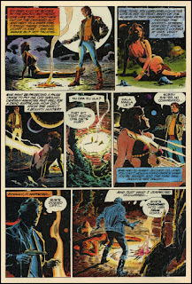
This is the earliest known rendering of the King Kong koncept. That Amazon woman over there didn't quite make it to the movie, darn it.
Willis O'Brien/Byron Crabbe — King Kong
Thursday, February 21, 2013
A Little Credit
Yes, Garbo is a stunner, but let's give a little credit to the outfit . . .
Wednesday, February 20, 2013
One of the Greatest
Michael Whelan—one of the greatest fantasy painters of our time . . .
Michael Whelan — Otherland: Mountain of Black Glass
Cover for novel by Tad Williams (DAW)
Tuesday, February 19, 2013
Few and Far
Back when I was collecting comics, I usually purchased based on pictorial quality, and not for the story writing. Comic book stories have usually seemed to me to be silly, simplistic or just downright stupid. Now don't get me wrong, that's part of the charm of being all-in-color-for-a-dime. But as comics evolved to become seemingly more 'mature' and certainly more expensive, I had greater expectations for the story quality.
EC comics in the '50s are consistently lauded as having had great art and great writing. Yeah, the art was pretty great, and the writing by Kurtzman and the Bradbury adaptations and a few others was way cool. But a lot of the stuff was predictable and silly, even though way above other comics of the time.
In the '80s, beyond the superhero genre, comics took on adult appeal more and more. Art was racier and of pretty good quality, but many of the stories were either retreads and/or just plain lame. I had great expectations from series like Alien Worlds and others. Here, Al Williamson's art was as good or better than his EC work and very reminiscent of those days, and the writing tries to be — but ends up being a tired old retread (writer to go unnamed here). You can see why some of us buy comics just for the art. REALLY good writing examples in this medium are just few and far between.
Sometime soon, I hope to post some samples of what I think is some really good comic book writing, superhero, no less. Stay 'tooned.
Above, Joe Chiodo —lovely cover of Alien Worlds #1, December 1982
Above and below, Al Williamson, from that same issue, very strong art
Labels:
Al Williamson,
comics,
EC,
Joe Chiodo,
sci-fi
Cowgirls
If you're a cowgirl, then or now, you have my immediate attention and probable affection, not that you care, cuz you're probably busy with your horse(s).
sigh
Cowgirl — ca 1900
Monday, February 18, 2013
Pale Hands I Loved Beside the Shalimar . . .
In the Golden Age of illustration, even prosaic adverts, usually for women's products, utilized storybook renderings to raise them to poetic beauty. In this case the illustrator was Gwynedd Hudson, far more known for her Alice in Wonderland and Peter Pan books.
Gwynedd Hudson — for Crème Shalimar — 1916-20
(The illustration dated 1916, the page from 1920)
Labels:
ads,
Early XXth Century Graphics,
golden age,
Gwynedd Hudson
Tombstone
If ever I have a tombstone, this is probably what it will look like.*
* But I'm more likely to be downloaded into an external drive.
Or as Deb points out in the comments,
maybe be uploaded to the cloud,
depending on what kind of life I've lived.
Or as Deb points out in the comments,
maybe be uploaded to the cloud,
depending on what kind of life I've lived.
Sunday, February 17, 2013
"A Masterpiece"
With all the remakes and re-envisioning of old films and books, I'm surprised that a 21st century version of T.H.White's Arthurian/Merlinesque adventures hasn't been made ala Lord of the Rings' digital film magic.
The musical Camelot was based somewhat on White's Once and Future King, and Disney did the animated Sword in the Stone, but it would be nice to see a faithful version of White's unique version translated to the screen. And, of course, Alan Lee should be the visionary for it, as he partly was for Peter Jackson's LoTR.
I know, at this point it would be like one more Gandalf or Dumbledore, even though Merlin was the original once and future wizard, and isn't there room for more in our collective imagination?
Alan Lee — The Sword in the Stone
Madcap
A madcap princess is my favorite kind of princess.
'Madcap'—that's a funny word when you think about it.
Theatre playbill — The Madcap Princess — 1926
Labels:
Early XXth Century Graphics,
theatre
Saturday, February 16, 2013
The Circus is Coming
Speaking of circuses and designs, these are lovely illustrations by Hilary Knight, graphically designed to a magazine format . . .
Hilary Knight — The Circus is Coming — 1979
front & back covers for Cricket Magazine
©1979 Cricket Magazine
Hilary Knight — contents page border
© 1979 Cricket Magazine
Hilary Knight — spot illustration
© 1979 Cricket Magazine
Labels:
Children's Books,
Cricket Magazine,
Hilary Knight,
magazine
Friday, February 15, 2013
A Useful Trade
I love working as a designer. It's fulfilling to see something emerge from nothing. And it's a useful trade as well, as just about everything you see around you had to be designed by someone. Even circus parades are aided with design:
Max Weldy — Circus Spectacle Parade Design — 1940
The Return of Marco Polo
When the World Was 1000 Years Younger
This is an intriguing illustration, considering it's from a kid's book of the 1920s/30s. It ran under the title, "When the world was 1000 years younger," and the caption, "An Arab Storyteller Entertaining the Caliph of Bagdad."
Thursday, February 14, 2013
Early Fritz
I'm delighted that I've made so many good friends via blogging.
One of our long time good friends that we met via the Whirled of Kelly blog is OtherEric of the Digital Comic Museum, who has here sent over some Frank Frazetta material. Most Frazetta fans know that Fritz was a comic book artist early in his career. It's sort of amazing to see his early funny animal cartoons when you know that he gave us sublime fantasy paintings in the bulk of his career.
These are some text illustrations from 1947 comic books, such as Happy Comics, CooCoo Comics and Goofy Comics. As cute as these are, Fate (in the guise of Roy Krenkel) made the right path for Frazetta, to help him land his Ace Paperback painting commissions.
all above illustrations by Frank Frazetta — 1947
Wednesday, February 13, 2013
Funky Little Number
Karen from Arkansas sent over this funky little number. Music sheets have thousands of cover images just waiting to be explored.
Thanks Karen!
Tuesday, February 12, 2013
Viva la Evolution!
Today's post on the ever-intriguing Histories of Things to Come reminds us that this is Charles Darwin's birthday, thus reminding me that I had a couple of Darwinesqe items in the scan file just waiting to be posted. There's a relevant page on the Pictorial Arts Journal.
Viva la evolution!
cartoon from Mr. Punch's Almanack — 1882
A magnificent portrait of Mr. Darwin
Labels:
Charles Darwin,
editorial cartoons,
photograph,
portrait
Monday, February 11, 2013
A Rarity
HERE's a rarity — the guy is nude and the gal fully clothed!
H. Granville Fell — Zephyrus and Flora — 1900
Sunday, February 10, 2013
Saturday, February 9, 2013
Man!
Man, I miss Antonio Lopez's energetic fashion renderings!
Antonio Lopez — L'Uomo Vogue — 1970
Antonio Lopez
Xtreme Level
Taking fashion photography to an Xtreme level, a brave model barely hangs on to the Eiffel Tower, just to get our attention:
Erwin Blumenfeld — Sur la tour Eiffel — 1939
Friday, February 8, 2013
Out on the Town
What a funtastic photo of Tarzan's little family out on the town.
Tarzan's New York Adventure — 1942
Handsome
This is a handsome digital medium rendering, utilizing some Mucha/Art Nouveau styling, brought to an androgynous slightly manga level, successfully giving new life to an old style.
© 2009 Shannon van Muijden — Declan O'Dwyer
Labels:
Art Nouveau,
digital médium,
Mucha,
Shannon van Muijden
Thursday, February 7, 2013
Run Away!!!
The Good Duck Artist took a little break from painting Donald and the boys to paint some real humans. Run away!!!
© 1978 Carl Barks — King Beowulf
Subscribe to:
Comments (Atom)


