Tuesday, June 26, 2012

Outrageous

Musical revues of the early twentieth century were a popular form of entertainment in the cosmopolitan centers of the world, but needed ever more beautiful women wearing ever more outrageous costumes to keep the customers coming back for more. Outrageous and innovative designers worked overtime to supply that demand.

Alfredo Edel — Black Butterfly — 1911

The costume above must have challenged lepidopterists in the audience to want to pin and mount this rare specimen.

William Matthews — Automobile Woman — 1913

Note the actual working headlights as epaulets and license plate numbers on her gauntlet gloves.

William Matthews — Aeroplane Woman — 1913

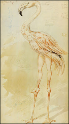
Alfredo Edel — Pink Flamingo Woman — 1908

This poor woman was strapped to stilts while leaning forward to keep her balance, all the while looking through a hole covered with a gauzy fabric in the base of the bird's neck.

Sam Zalud — Ostrich Woman — 1918

Myra Butterworth — Teacup Woman — ca 1920

Note the rising steam headdress. This and the design below were part of a Tea Service set that also included a teaspoon, sugar bowl and creamer, a serving tray, a bowl of orange marmalade, a butter dish, and a sugar cube with tongs.

Myra Butterworth — Teapot Woman — ca 1920

Homer Conant — Fireworks Male Dancer — ca 1915

Okay, coming in from left stage, this and the design below were for the ballet, for male dancers, the one above with what one would assume would be real sparklers fitzing around his twirls and leaps.

Homer Conant
Spoof Performance of Nijinsky in Afternoon of a Faun

Leon Bakst
Nijinsky's real costume design in 'L'Après-midi d'un Faune'

Great Inspiration

The Dillons have always been a great inspiration to our studio . . .

Leo and Diane Dillon — Boy at the Window — 1977

Monday, June 25, 2012

Diversions and Daydreams

Ralph Bakshi had a thing for Tolkien, like many of us did, before it was the quintessential hippie read in the late '60s. Some of us made a few renderings here and there of our visions of Middle Earth. But most of us found other diversions and daydreams, while Bakshi buckled down and went on to make the ambitious animated film, Lord of The Rings (part 1 only, doggone it—not his fault!)

This painting was made by Bakshi at least 7 years before the film, although it does seem to be a loose interpretation of Tolkien.

Ralph Bakshi — A Scene from Tolkien — ca 1971 or earlier

You can visit Bakshi's official website here.

Cannot Overuse the Word

I'm aware that some people's pet peeve is the overuse of the word 'genius' and other such. But I do not use that word lightly when I refer to the EC gang. The whole motley crew was pure genius at what they were capable of. And Bill Gaines was genius for recognizing and fostering their genius, both at EC proper and later Mad magazine.

This piece by Wally Wood, which I don't think was for EC in any way, is genius for its organized complexity—seemingly effortless in its execution. Zoom in on the figures and see how fully realized they are! I cannot overuse the word when it comes to EC guys—they were geniuses!

Wally Wood — Fully Computerized

Sunday, June 24, 2012

The Entertaining Comic Group Hard at Work

This is a MASTERful illustration by the late John Severin, a man whose talent sometimes was not appreciated as much as it deserved by people who wanted his work to be goofier.

This piece is an amazing composition, with everyone in proper context to each other, yet with perfect placement for the lettering balloons. What a cool print to receive in the mail just for sending in an idiotic letter to the editor.

John Severin — EC Thank You Note — 1950s

A Great Imaginist

Gustave Doré was a great artist, though not usually considered a great painter, though he dearly wanted to be.

He was a great IMAGINIST, preparing thousands of drawings and paintings for the engraving process that the publishing media was limited to at the time.

As I have indicated before, I would dearly love to see a large book dedicated to Doré's non-engraved works.

Gustave Doré — les fées — 19th century

Alright, sort of one more green theme to ease us out the door.

Emerald City

The last of our little green theme, the paperback reprint cover:

John R. Neill — The Emerald City of Oz

Saturday, June 23, 2012

Reminiscent of Frank Kelly Freas

Green is a rare color for astrophotography, but when the image results from an infrared exposure, all bets are off, with colors sometimes assigned to specific gases or elements or what have you, for scientific clarification.

This fantabulous infrared image shows the M17 Nebula (the brightest area) and heated dust structures associated with the nebula. The fascinating dark streaks are likely ripples of star formation — and are to me, with the rest of the image, very reminiscent of a Frank Kelly Freas illustration, coloration and all. I expect to see one of his trademark spaceships blazing across the foreground and a semi-hidden image of a sci-fi character in the background.

Spitzer Telescope — M17 Nebula — ca 2010

Background for Fleshtones

Surprisingly, green makes a lovely background for fleshtones.

Elle — October, 2000

Sorry, but I de-blurbed all the pesky non-pertinent cover blurbs.

Friday, June 22, 2012

Nature Sprite

What other color would a nature sprite be, but green?

Disney Studio — Nature Sprite
Fantasia 2000 — Stravinsky's Firebird Suite

Theme of Dominant Green

It seems I've got a little theme of dominant green going on here.

The Dance Magazine — March, 1931

Disappearing Creek

I'm not always a fan of modern "southwest art", but I do like the work of Howard Terpning.

Howard Terpning — Cheyenne at the Disappearing Creek — ca 2000

Thursday, June 21, 2012

America's Second Most Challenging Sport

Talk about gratuitous use of female charm to promote a product . . .

. . . I . . . feel . . . compelled . . . to . . . learn . . . archery . . .

magazine ad — ca 1970s

The Motor Pump

Ads showcasing a pretty girl that is totally irrelevant to the product advertised is a tradition that goes back a ways. Nice Art Nouveau.

Tamagno — La Moto-Pompe — ca 1898

Wednesday, June 20, 2012

Crown of the Year

'Tis the summer solstice, a magical time, also known as MidSummer. I've never understood why the first day of summer is called 'mid', but then there's many a mystery in my little world.

C M Gere — MidSummer — 1893
from the English Illustrated Magazine

Poems by Shelley

. . . weak - in - the - knees . . .

H. Granville Fell — Poems by Shelley — ca 1900

Tuesday, June 19, 2012

The Song of Songs

Some books make me go weak in the knees . . .

H. Granville Fell — The Song of Songs — ca 1900

Favorite Fictional Four-Color Female

Sorry I missed commemorating the anniversary of Krypton blowing up, and wow, Kal-el made it to Earth the very next day! But I'd rather celebrate the birthday of Shayera (Hawkgirl), one of my favorite fictional four-color females, especially as delineated by Joe Kubert who gave her a sparkling joie de vivre.

Don't forget to have a moment of silence for Wing on the 28th.

note: this calendar dating is not for this year!

Joe Kubert

Joe Kubert

Joe Kubert

Steve Rude

TV Romances

Commenter in the last post had it right when he said that, back in the day, illustrators knew they'd arrived if they had a TV Guide assignment.

Well, I never even tried for an assignment, but just for the fun of it in the early '80s, I did mock up a cover. I produced the art, using watercolor and colored pencil, the same size as the publication and then used Letra-Set press-type for the lettering.

Drew Struzan I was not, but maybe if I'd tried a little harder . . .

Thomas Buchanan — faux TV Guide cover —early 1980s

Monday, June 18, 2012

High Road to Adventure

Way back in 1982 there was a tv show, Tales of the Gold Monkey, that shared the same high road to adventure that Indiana Jones had just recently taken. The show had actually been conceived a lot earlier than anyone had even heard of Indy, but was a hard sell to the networks because it was 'adventure in the 1930s'. But along came the blockbuster film and THEN the network execs sat up and took notice.

Of course just the words 'adventure in the 1930s' sets my tail to wagging and I remember enjoying the show when it first aired. Stephen Collins as Jake Cutter and a Jack Russell terrier as Jack were fun to watch.

Of course then the choice of having Drew Struzan create the promotional art for the teevee show helped to connect it to the Indiana Jones movie's success. I LOVE Struzan's graphic talents and would love to see him illustrate ANYthing, and he certainly caught the essence of Jake and Jack on their high road to adventure!

Drew Struzan — Tales of the Gold Monkey — 1982

Drew Struzan — Tales of the Gold Monkey — 1982