Sunday, January 8, 2012

The Ultimate Legal Entertainment Experience

Not your great-grandfather's Barnum and Bailey Circus, The Electric Circus was right smack in the midst of tuning in and turning on in the late 60s. I had a girlfriend who went to work there.

Jacqui Morgan — The Electric Circus — 1967

From Wikipedia:

The Electric Circus was a nightclub and discotheque located at 19-25 St. Marks Place between Second and Third Avenues in the East Village neighborhood of Manhattan, New York City, from 1967 to September 1971. With its invitation (from one of its press releases) to "play games, dress as you like, dance, sit, think, tune in and turn on," and its mix of light shows, music, circus performers and experimental theater, the Electric Circus embodied the wild and creative side of 1960s club culture.

Flame throwing jugglers and trapeze artists performed between musical sets, strobe lights flashed over a huge dance floor, and multiple projectors flashed images and footage from home movies. Seating was varied, with sofas provided. The Electric Circus became "New York's ultimate mixed-media pleasure dome, and its hallucinogenic light baths enthralled every sector of New York society." Its hedonistic atmosphere also influenced the later rise of disco culture and discotheques.

Experimental bands such as The Velvet Underground, jam bands such as The Grateful Dead and avant-garde composers such as minimalist Terry Riley and electronic music pioneer Morton Subotnick, played at the club. Other bands played there before they were famous, such as Raven and "Soft White Underbelly" before it became known as Blue Öyster Cult, the Allman Brothers Band, Sly & the Family Stone and The Chambers Brothers.


Jupiter

My wife and I took our daughter to the circus several times when she was younger, but none of us really enjoyed it—it was loud with the daredevil motorcycle roaring around in the sphere of death, the other acts were either trying too hard or not enough. Finally our daughter said 'thanks anyway' and chose not to go back.

But an act like the poster below would have enticed us I'm sure. That looks like fun, complete with a 'gorgeous pyrotechnic display'.

Barnum & Bailey — Jupiter — 1909 poster

BOOKS

Read, Captain, read — upon your mystery ship . . .

N. C. Wyeth — Books — poster

A Return to Morality

What's all this fuss I read about Charles Addams being 100 years old?

Charles Addams — Publishers Weekly — August 1973

Saturday, January 7, 2012

Illustration and Photography

At the dawn of the 20th century, and early in his career, Lejaren à Hiller was an accomplished illustrator, and in time his attention turned to photography. He became known as the creator of American photographic illustration, staging complex tableaux, and much like a movie director, he visualized the sets and directed the models while an assistant operated the camera. Not to compare myself to him except in philosophy, Hiller was "more interested in the final result than the means used to achieve it".

Below, he staged Aspasia, a renowned figure in Athenian history. If you're interested at all, google her, there's some good information. And below that, an example of his earlier illustrative style, pretty good in my opinion, with nice design qualities.
Lejaren à Hiller — Aspasia of Athens — 1933

Lejaren a Hiller — Life magazine — October 1914

Blogger and/or Tumblr Guy

Walter Crane was a versatile artist of the pre and post 1900 era, with a style of art that lived in the arts and crafts movement and worked backwards from there. In other words, his work was beautiful, but not modern in any way.

So it's a surprise to see this little cartoon sketch of his that shows the 'man of the future', a button presser that looks to me like a portrait of a blogger and/or tumblr guy plugged into his fancies.

Walter Crane — Man of the Future — ca 1900

Friday, January 6, 2012

Wiener Chic

Now THERE's a magazine title that might work in the 21st century!

Mucha — Wiener Chic — January 1905

Pause

Let's pause a moment from our high-speed, high-jink antix of chasing after images and let me have a word (or two or three) with you, if I may . . .

George Herriman — Krazy Kat

I hope you're enjoying the show in this little corner of the blogosphere (wow, spellcheck is okay with that word), but I want to reach out to you other blogotainers (okay that got spellcheck's attention) and remind some of you that blogger's light box function is extremely irritating and off-putting for a lot of folks looking in to your blogs. I guess there's a way around it by right clicking or left clicking or hitting your mouse with a hammer. But some of us have Macs and a wireless mouse with no clicks and no way to easily look closely to your hard-earned images. The best answer is to turn-the-gosh-darn-function-OFF.


Thank you and happy blogging.

We now return to our regularly scheduled posting. Do not adjust your set . . . no, wait! DO! DO adjust your set! bzzzzzzzzzzzzzzzzzzzzzzzzzzzzzzzzzzzzzzzzzzzzzzzzzzzzzzzzzzzzzzzzzz

Just Great

This post is dedicated to Annie Swann, great friend of this blog, whose great Art of Narrative blog has wonderful fanciful images, usually from the great Golden Age of Illustration. Annie is a great fan of great illustration, great faerie art, and through seeing some work on this blog, great Beatrice Stevens art.

In total candor, I found the original monotone state of this drawing a bit flat, though totally beautifully drawn. To me it cried out for some sort of tonal values to give it a bit of depth. So, I gave it a duotone treatment. And if you don't like that, for you purists I've included the original state below that.

This is a total side note, but it's an autobiographical blog, so I'm entitled. Before I was married, I dated a couple of young women, who as I got to know them more, revealed that they liked to color with crayons in coloring books, just for mindless relaxation. I found that to be charming and endearing and I never discouraged those sorts of 'hobbies', even though I had no desire to emulate.

Until now. With digital programs I find myself taking existing line art and having at it with colorizing techniques. I can justify that, I tell myself, thinking that I'm training myself to be a colorist for the comics industry, but in reality it is mindless relaxation.

Beatrice Stevens — The Faeries (modern color) — 1917

I love the individual attention each faerie got from Stevens, but especially the one just to the left of the little girl, emulating her pose. A girl and her dog, with a big book of fantasy in her lap — Annie, that's how I visualize you as a kid.

Beatrice Stevens — The Faeries (original state) — 1917

Thursday, January 5, 2012

Optimism and Hard Work

I worry about the economy even though there isn't the least thing I can do about it, and I dread the thought of my daughter launching into a world that is on the verge of shutting down. But then I think of the hard times of the past and how society weathered them and prospered. Optimism and hard work will get us through.

Just a scant few years into the great depression and industry was chugging mightily as Fortune smiled down upon us . . .

T. M. Cleland — Fortune — January 1932

Of course the clouds of war were gathering on the horizon . . . crap.

Stories to Stagger the Imagination

Here is an interesting duo of images to compare, but I'm at a loss to describe how or why they came to be this way. The top image is an inked and nearly finished comic cover by Gil Kane. It functions well as a cover ready for production—coloring, adding the issue #, price and DC logo. But it never went 'beyond' that stage (a pun that is stillborn) . . . but the bottom image is the same cover, rendered completely by Neal Adams, and made its way to the comic spinners where I bought it 42 years ago.

Okay, so why wasn't Kane's cover used, though you can see the title changed, and actually Neal Adam's cover is better because the angle of the comet earth is more acute, aiming right for our intrepid moon men, and the angle of the scene puts them in more imminent danger. Was Kane's rejected? But why not have him redraw it? A whole bunch of other meaningless questions come to mind, but all I know is—any answers might stagger the imagination and would come from . . . BEYOND the UNKNOWN!

Gil Kane — From Beyond

Neal Adams — From Beyond the Unknown #3 — 1970

Pugnacious Mug

I love scrutinizing photos of legendary people, searching for the characteristics that make their faces so iconically unique.

I know Jimmy Cagney didn't always play the lost guy with a bad attitude, but he did own that persona in this or that movie.

So it was interesting to scrutinize his pugnacious mug as an actor and compare it to his pugnacious mug as an infant.

Jimmy Cagney — age: I dunno, what? 25? 30?

Jimmy Cagney — age: 1

Wednesday, January 4, 2012

Mean . . Moody . . Magnificent

Zoe Mozert is one of my top favorite 'pin-up' artists, with her verve and depth of rendering. Her movie poster rendition of Jane Russell in The Outlaw is superb and a classic of the genre.

Below, you see Mozert in the enviable position of having Russell posing for her, back in 1943. The pastel painting might actually be in progress, a rarity for that kind of publicity shot.

Below, somebody else did their lurid version of Mozert's art, sensationalizing it more than it need be, in my opinion.

Below, some other artist veered off in another direction. And there are a number of other versions out there. Such as here.

Such is Hollywood.


Kinetic Energy

There is great strength in an archer and great strength in an image of an archer, poised at the critical point of greatest kinetic energy — the calm before the storm — and then let slip the arrow fly.

Esteban Maroto

Jeffrey Catherine Jones

Ingam
(Enzo Duffloco Magni)

Anthony Beauchamp

Robert Mapplethorpe

Tuesday, January 3, 2012

Suitable Only For Adults ; > )

Peter Lorre's character acting was always a bit over the top, and yet subtle. How is that possible? However he did it, he was a beloved ensemble player—so much fun to watch.

Here is a favorite publicity still from Mad Love.

Peter Lorre/Frances Drake — Mad Love — 1935

The poster, below, didn't catch Lorre's looks, but E for effort.

Mad Love — poster — 1935

Resolution

Resolve this year to get out from whatever thumb you're under.

George Herriman — Krazy Kat

Starlight Wonder

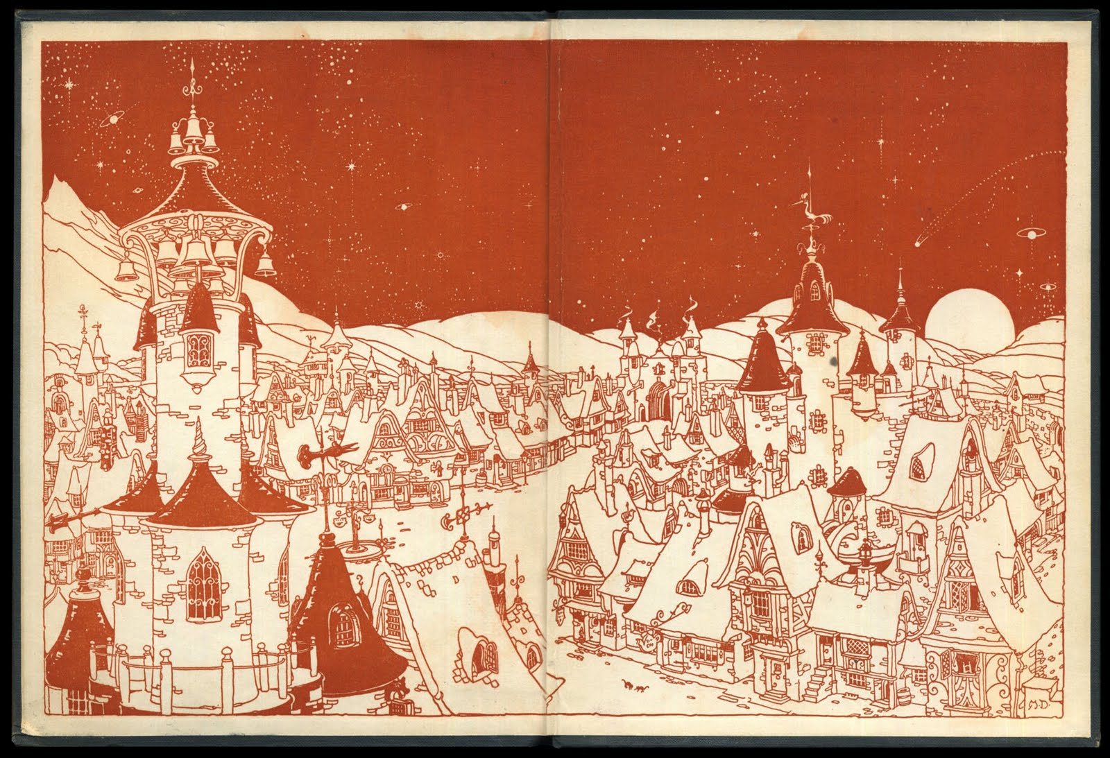
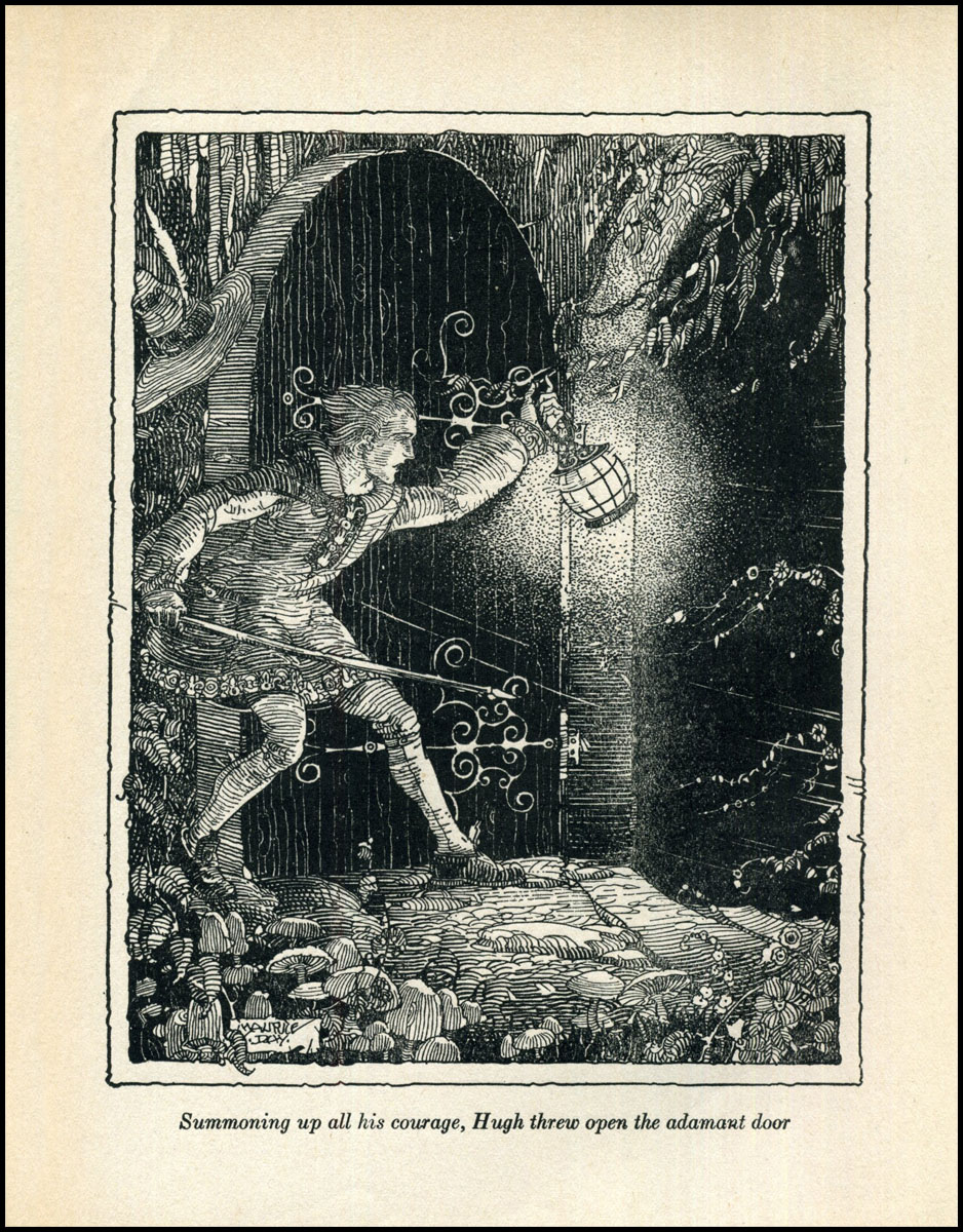
Maurice Day really knew his way around an inkpot.

Of several Maurice Day illustrated books that I have, The Starlight Wonder Book is my favorite. This 1923 edition has been enjoyed by others over the years, evidenced by the wear and tear that comes from reading, not negligence.

The endpapers have to be close to my favorite of all time.

Maurice Day — The Starlight Wonder Book — 1923
cover

endpapers

frontispiece

frontis and title page

dedication


Monday, January 2, 2012

For All You Followers of the Female Form

To help warm up the post-holiday blues for all you followers of the female form, here is a Harper's promotional poster from a few years back, based on one of its covers, featuring the amazing loveliness of Gisele Bündchen.

Personally, I think the colorful typography adds to the graphic impact, making an iconic poster of the early 21st century.

Harper's Bazaar — Gisele Bündchen — 2002

Storming Up the Stair

Here is another closer examination of a Sunday panel of Hal Foster's Prince Valiant—just one 'ordinary' panel, but a masterpiece of composition from the 1960s.

Val is battling his way up the staircase, yet is front and center with his men for us to know who the good guys are here, displaying his heraldic horse and all. The perspective and shadows feel proper and the melange of arms and legs are perfectly placed and connected so that we feel a total authenticity to the scene.

Foster was not using models or photos here—you couldn't stage such a scene. This is his mind and hand at work.

Hal Foster — Prince Valiant — panel detail

Electric Air Boat

It was a hundred and nine years ago today, but eleven months before the Wright Brothers first powered flight, that this cool neat-o electric air boat was making its way through the imagination of armchair adventurers everywhere.

Thoughts of flying were in the air, so to speak, with all kinds of attempts, and the time was ripe for it to happen—I just wish Orville had been reading this mag and called out to Wilbur, "Hey Will, maybe we should try it THIS way . . ."

Frank Reade Weekly Magazine — January 2, 1903

Sunday, January 1, 2012

The Month of January

Talk about the old days—here is a nostalgic scene from 1670 Rotterdam area, in the Netherlands, showing us skaters and Kolf* players on a frozen river (possibly the Rotte River?), in the month of January. A beautiful city in olden and modern times.

Herman Saftleven — The Month of January — 1670
black chalk with grey wash

*"Kolf is played by hitting a ball with a stick - a cross between a golf club and a hockey stick. The object is to hit the poles on the kolf pitch. Kolf used to be played on ice as well as on dry land. For centuries, ever since the Middle Ages, it was the most popular sport in the Netherlands: much like football today. Now it is only played in West Friesland."

Happy January One!

Erté — Playboy cover — January 1987 (a very good year for me)