Monday, January 31, 2011

Different Effect

Say what you will about the Disneyfication of classic children's stories, Disney's production concept artists were tops in their abilities to evoke mood and atmosphere, as well as giving credibility to fantasy.

Some years ago I did a minor amount of design and artwork for the Disney people involving Bambi, and received an invitation to a reception, and that invitation had this watercolor image on the front:

Later, I clipped the image below from a daily newspaper. You can see that it's the same image, with less cropping, and yet has not only a different color palette, but a subtler rendering to it. Examples of how the same basic artwork can be used to different effect.


Last Word

Alright alright. Virtue has to get the last word in. Stop shoving.

Ladies and gents, here's 'virtue'. La dee da.

Correggio — Allegory of Virtue — tempera on canvas

Correggio — study for Allegory of Virtue — distemper on canvas

Vice Squad

Here's a guy gettin' picked on by a squad of vice. Leave him alone you goons! Can't you see he just wants to enjoy your company in peace?! Can't a guy just have a little fun?!

Correggio — Allegory of Vice — tempera on canvas

Correggio — study for Allegory of Vice — red chalk

Sunday, January 30, 2011

Les etoiles du matin

Astronomy at its finest . . .

Sarah Ball Dodson — The Morning Stars — 1910

Saturday, January 29, 2011

Immortalized

Imagine being immortalized in a portrait by the great golden age illustrator Edmund Dulac!

Dulac was commissioned by Her Serene Highness, Princess Alice of Monaco to paint her five-year-old goddaughter, Vivian St George in 1917. Who knows whatever happened to Vivian (who would be 99 if she were still alive today), but she is forever five in a near fantasy setting appropriate to Dulac.

But not such fantasy, as those are Vivian's pet rabbits. Dulac sketched the rabbits from life in a series of spontaneous brush and ink drawings, some shown below.


Heresy

I know this is heresy, but Maxfield Parrish is NOT one of my favorite golden age illustrators. Maybe it 's over-exposure that limits my appreciation, and don't get me wrong—his work has many high water marks, yet in general I like a lot of other illustrators' work more. But this illustration by Parrish is intriguing for its technique and its wealth of content in such a small space.

This is the original art for one of the illustrations from Kenneth Grahame's 'The Golden Age', an 1899 book. The art is black and gray wash, with white gouache touches, over graphite on beige wove paper. The inscription, by the artist, says:

"Alarums and Excursions." — Once again were damsels rescued, dragons disembowelled, and giants . . . etc.

Friday, January 28, 2011

Ariane

Isn't this is a buttery-bright opera poster for Ariane, a five act opera by Jules Massenet . . .

Albert Maignan — Ariane — 1906

Explaining the pictorial elements used in the poster:

'The story is based on the mythology surrounding Theseus and the sisters Ariane and Phédre. The two sisters are both in love with Theseus, yet he chooses Phédre over Ariane. When Phédre is killed by the toppled statue of Adonis, Ariane travels to the underworld to beg Perséphone for her sister's resurrection. Softened by Ariane's offering of roses, Perséphone complies and Phédre returns to earth. Theseus is then made to choose among the sisters again and once more chooses Phédre, abandoning Ariane on the banks of Naxos. Distraught, she is lured into the sea by the voices of beckoning sirens.' —Wiki

Thursday, January 27, 2011

Mediterranean Beach

Time for another watercolor by Sir William Russell Flint, this one combining his love for figure studies and the life Mediterranean. Flint was so prolific, over his many years, with his watercolor studies that I suspect there are many out there still waiting to be uncovered.

Sir William Russell Flint — Bathers on a Mediterranean Beach

Wednesday, January 26, 2011

Yeah, I'm Nuts

In the previous post I said I was probably nuts for thinking Frank Papé may have inspired Will Elder with his rendering style and sense of humor. Well, yeah, I'm nuts. In the back of my head I think I had this rendering from a Mad magazine in mind:

This is Elder's funny rendering of 12 year old Pocahontas putting herself in harm's way to save John Smith. I'm not even sure whether the entire drawing is Elder's, or maybe he doctored an old print. Either way I think it's an anomaly for Elder. But still, take a close look at some of those Papé drawings—the funny little details, the animated gestures . . . I dunno, I bet Elder could've seen that stuff and eaten it up . . .

Spectrum of Style

To me, Frank Pape's work is a joy to behold, yet it's interesting how his style runs a spectrum even within one book. His illustrations for a 1926 edition of Thaïs by Anatole France — as seen here — are dramatic, decorative, sensual AND humorous. His work is somewhat comparable to Willy Pogany.

I'm probably nuts, but looking at this work, I see a possibly huge inspiration on Mad Magazine's genius artist Will Elder, especially his early stuff. I'll post one of those next time, just to compare.

Anyway, Frank Papé should be an inspiration to many.


Tuesday, January 25, 2011

Colophon

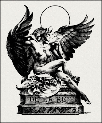
Stephen Fabian designed this intriguing colophon for Gerry de la Ree, his oft-time publisher.


'Lovely' Tales

I know I use the word 'lovely' many many times, only because that's what so many images are . . . lovely, that is.

As here, a title page by Reginald Knowles for a 1910 edition of Tales from the Norse. The border treatment appears to be heavily influenced by Walter Crane et William Morris.


Monday, January 24, 2011

Fantasy Postcard

The last time we saw Raphael Kirchner's work on this site was over a year ago, and it was a cool series for Flo Ziegfeld's theatre. Here, Kirchner has created a lovely fantasy postcard, utilizing a technique that appears to be a form of pointillism, a time-consuming effort that seems rare in commercial illustration.

Raphael Kirchner — postcard design — 1910

Woodland Serenade

Here's a big piece of candy, all sweet and chewy, by Harrison Cady.

Y'know, Cady—as a cartoonist and children's book illustrator—was a huge influence on the young Walt Kelly. Sometime I hope to show some specific parallels.

Harrison Cady — Woodland Serenade
St. Nicholas Magazine — 1907

Knowing, As Only He Can Know

A nudder liddle dose of Wallace Tripp, and den really, we godda get back to our regularly scheduled eclecticism.


Sunday, January 23, 2011

Boyoboyoboy

Continuing a Wallace Tripp theme from last post . . .

This and all future Wallace Tripp posts are dedicated to Larry MacDougall and his family!

Joey to the World!

Boy, am I proud to present a segment of the world-renowned, beloved by everyone, epic saga of Kanga Boy by Wallace Tripp. Boy oh Boy. Chef Boy R Dee. Man and Boy. Boystirus. Boyzenberry.

Did I mention it's by Wallace Tripp? Spa Fon! Hoo boy.


Saturday, January 22, 2011

Military Necessity

The great adventure cartoonist Milton Caniff created a comic strip just for servicemen during World War II, Male Call, featuring the sexy and liberated friend of G.I. and general alike—Miss Lace.

It's thought by many that the immortal Bettie Page's hairstyle was inspired by Miss Lace. In fair play turnabout, here, Jim Silke pays tribute to Miss Lace—having 'Bettie' emulate one of her iconic poses, as seen in the lower images by Caniff. You can see a nice collection of the comic strips at Mr. Door Tree's blog site, by clicking here.

Jim Silke — Bettie as Miss Lace

Milton Caniff — Miss Lace

Friday, January 21, 2011

The Dragoman's Jest

Ah, to be an armchair adventurer in the 20s, 30s and 40s . . . so many books, movies, magazines, comics and pulps to heat up your blood. And the Orient was by far the location of choice to fight for freedom, riches and princesses, not necessarily in that order. Usually the babe was worth risking everything for.

J. Allen St. John — Oriental Stories — Winter 1932

Arthurian Obscurity

For collectors of all things Arthurian, here's an obscurity— a souvenir program from the 19th century play King Arthur by J.Comyns Carr, starring Henry Irving as Merlin.


Thursday, January 20, 2011

A World to Conquer

Michael Whelan is another wonder of the modern fantasy art world. One of the 7 wonders? We'll have to see, down the road aways.

A number of modern illustrators have delivered wondrous visions of the Edgar Rice Burroughs realms. But Whelan set the bar pretty high when he painted his set of Barsoomian covers for the Del Ray version of the John Carter series.

This wrap-around cover of A Princess of Mars is among my favorites of all time, if nothing more than for the sheer heroic posturing—but of course Deja Thoris might have something to do with it.

Above, the painting beautifully unencumbered with type elements.

Above, the painting beautifully encumbered with type elements.

Above, the gorgeous preliminary drawing.

Above, some preliminary designs.

Above, some character workups.